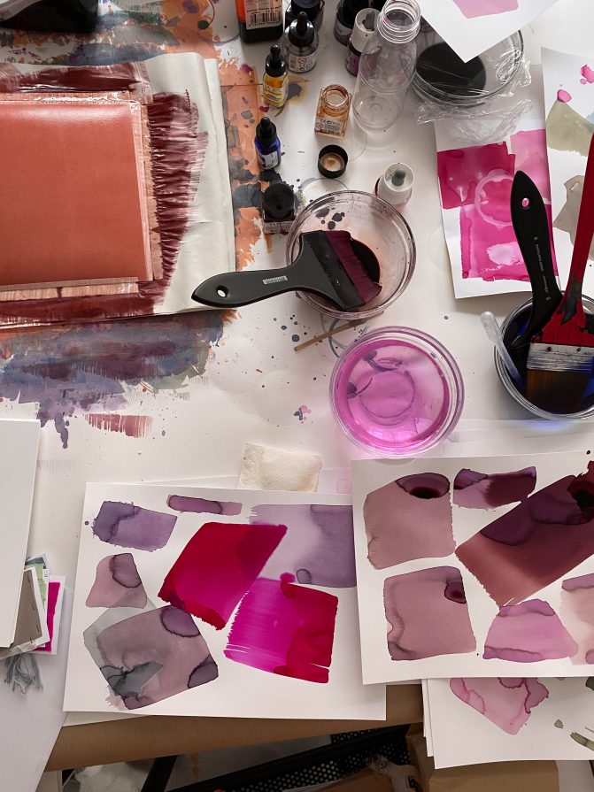
Since 50 years Peclers has built a unique color expertise. All our colors are exclusive and “home made”.
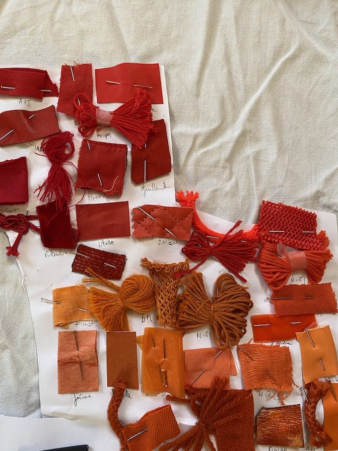
Each season, these colors are presented in our COLORS trend book and are available on paper samples, yarns and fabrics. This working tool offers harmonies targeting all markets and insight into color evolution by season.
For Première Vision, Elisabeth Prat Fashion Trend Director shares with us a color theme destined to energize FW22-23 season – a new focus on “Fleshy” colorways!
This range of intense, warm and sensual colors, which is included in the Winter 22-23 color book, directed by Dominique Assenat, perfectly echoes the orange and red direction found in the Première Vision color range, decoded in full in this article.
Here we give the floor to Elisabeth Prat, for a full breakdown of this energizing range.

The unprecedented period we are going through calls for energy and vitality – and sometimes even a little madness!
The choice of this “Fleshy” range, which is among our 7 color range choices in our Winter 22/23 color trend book, comprises intense, warm and sensual colors.
Red is one way to pull us out of the atmosphere of doubt and gloom, injecting a dose of cheerfulness to kick things off again with a real momentum.
I firmly believe in the psychological effect of color.The color you wear, that color you choose and want to wear right from the morning, can influence your life and your mood that day.
We were able to test out and feel this effect for ourselves, even when we didn’t necessarily have to go anywhere. We had the whole experience of getting dressed just for ourselves, for a very small group of people, or to talk into a computer screen. Have you noticed, like me, that wearing non-color or black in the middle of winter doesn’t do anything to help you have a better day?
On the other hand, a color that is either harmonizes or contrasts with the prevailing light, or with your skin tone, can be a powerfully soothing or energizing.
We often talk about colors therapy. Look at the symbolism of red – it’s so interesting to see that there’s both an idea of power and strength, and, at the same time, a notion of danger and interdiction!

Red was once reserved for the aristocracy and has since been used for road, maritime and sports signs. It’s a warning one!
To discover the full interview as well as the “Fleshy Range” visit Première Vision’s platform: Fashion Guest – Elisabeth Prat.
Contact us to discover more about our COLORS book!

Colors trend book FW 22-23
Nature’s infinite variations set the mood for this season. Whether[…]


