

Beyond trends and their product translations, color is a critical element of brand marketing. It holds a unique power: turning a likeable brand into a brand that lasts—a love brand. Peclers Paris decrypts this superpower with insights from Mai Nguyen, Style Director and expert in color marketing, and Brune Ouakrat, head of strategic planning and prospective at the agency.
What role does color play in a brand’s marketing mix?
Color plays a crucial role in both the initial purchase motivation and the long-term preference definition for a product. Studies have shown that for 85% of consumers, color is the primary factor in choosing a product, and it contributes to 80% of the recognition score for a familiar product. It acts as an immediate gateway because it conveys everything that is unspoken or even unspeakable: what the brand activates in terms of cultural imagery and its symbolic value are communicated through color. This drives desirability, making consumers choose one brand over another with equal product benefits. Hence the importance of having a color personality, which we at Peclers call color positioning.
What is color positioning and what is its purpose?
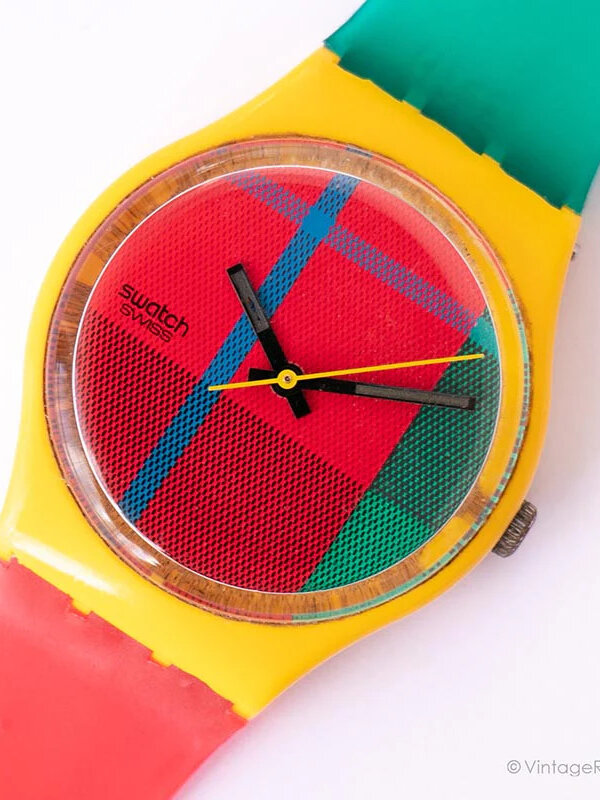
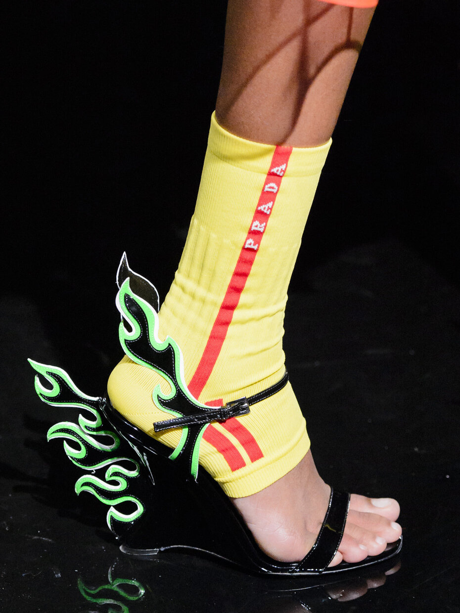
Like any positioning, it’s the brand’s unique viewpoint versus its competitors. Specifically, it defines the very specific and distinctive way a brand uses color. This standpoint then influences all its creative expressions. Logically, all love brands have defined their color positioning, from Apple to Prada to Swatch. Because a love brand must be recognizable at first glance and, beyond its products, it unites its audiences behind common values and language. It’s a brand that culturally signifies its era. Color is the non-verbal language of culture, a language that appeals to emotions. It fosters engagement and attachment and is memorable.
Examples of love brands whose use of color has contributed to their success?
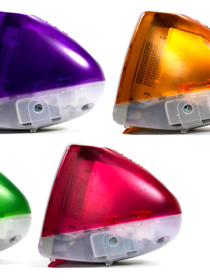
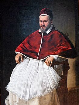
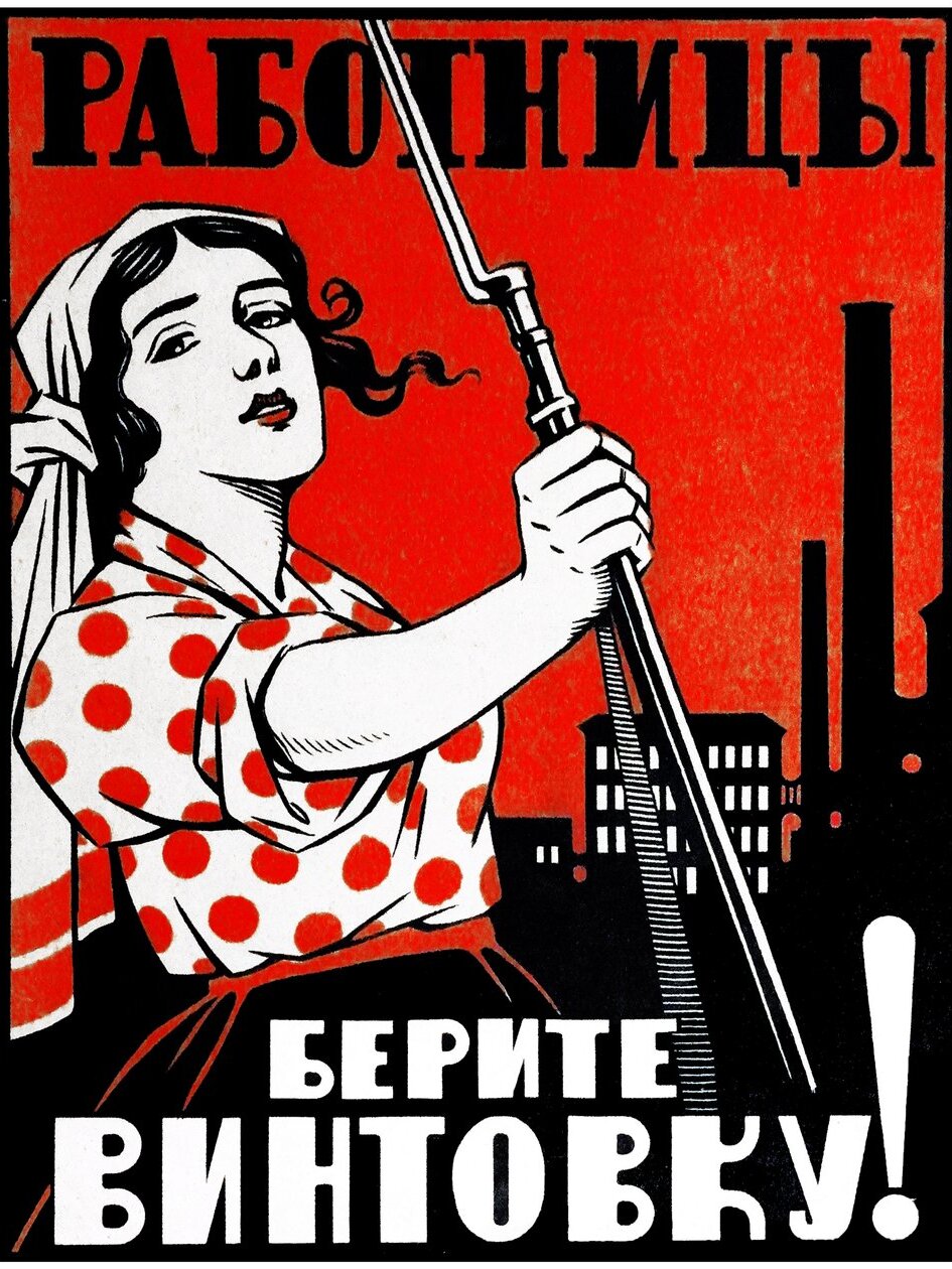
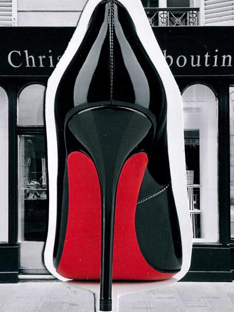
IKEA, whose logo colors, taken from the Swedish flag, embody a promise: Swedish design, in other words everyday quality, and accessibility. Hence the creative color approach, a mix of strong pop colors and “Nordic” neutrals, comfortable but not boring. In fashion, Jacquemus has differentiated itself through color, with bright and joyful hues in a series of monochromes (almost to the point of overdose) to express its creative purpose: a sunny brand that transforms the excessive into the desirable, turning “popu” into luxury. Finally, Cartier, by exploiting in its communication the iconic red/gold of its identity, plays on the desirability of a power brand, whose boxes are collected as products in themselves.
How is a color positioning developed?
It all starts with the brand’s overall positioning, with the challenge being to translate it into a color perspective, essentially creating its color portrait. If I am this, express that, and differentiate myself from my competitors in this way, here is who I am in terms of color (family, rendering, usage, etc.). It involves both a positioning exercise and a tone of voice. By intersecting the brand’s positioning with the predefined framework of color language and its uses—keeping in mind sector-specific variations and competition of this language—we can write the grammar of a brand’s unique “color language.” In other words, how the brand “speaks color” uniquely, personally, and remarkably, to reflect its identity. This color grammar is then concretely applied across the entire marketing mix.
Is color a universal language?
Yes and no. Originally, it presents significant cultural divergences, which still exist. In the West, mourning is worn in black, whereas in the Muslim world and Asia, it is worn in white. White, which in the West signifies peace, purity, and marriage. However, with globalization, there has been a certain homogenization of imaginations and, consequently, of color representations, at least (but not systematically) in the product field. But beyond the question of cultural universality, there is also the intimate, individual cultural particularism. No established recipe, therefore, it’s the step to the side that allows for a silent, and all the stronger, connection with the targets through color.
Each season, Peclers Paris presents in its COLORS trend book – published two years before the season it targets – 45 exclusive hand-made colors. Organized in 7 ranges, they are the source for all the harmonies presented in our various trend books covering the fields of fashion, beauty, design & lifestyle.
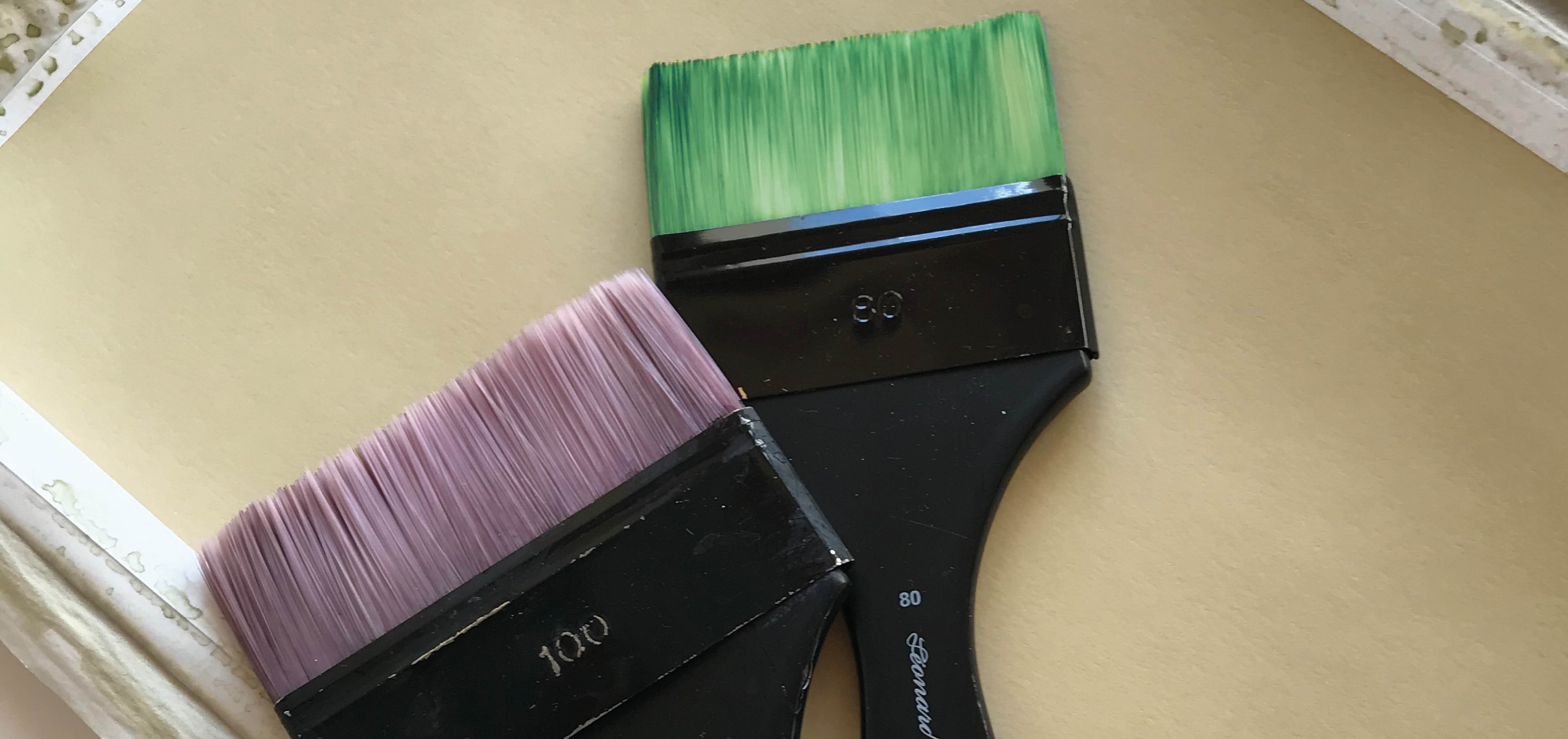
These colors are born from a very thorough methodology that starts with our trend prospectivists gathering for a “CONCERTATION COULEUR” to share their choices and the rationale behind them. Then our colorists establish a synthesis, bearing in mind the broader picture of how color have been evolving over the last few seasons.
Finally comes the lengthy process of creating by hand the exact shades that only exist in their minds so far. Blending pigments – a single drop can make a huge difference – and achieving the exact level of intensity stroke after stroke… A final round of passionate discussions with the whole Peclers Paris team and the colors of the (future) season are here!
SS26 Colors trend book
What will be the major Color trends for the Spring Summer 2026[…]